ctrides
from print to digital—and website to out-of-home—we took ctrides in new directions with a re-brand—and every bit of it’s been a joyride.
ctrides is a brand, that simply said, exists to do good. their mission? to make connecticut a healthier place to live and work by reducing single occupancy vehicles (sovs), the state’s highest source of greenhouse gases.
they have two primary targets to help reach this goal: employers who encourage employees to use car pooling, van pooling, cycling and walking and commuters themselves.
driving change, not cars
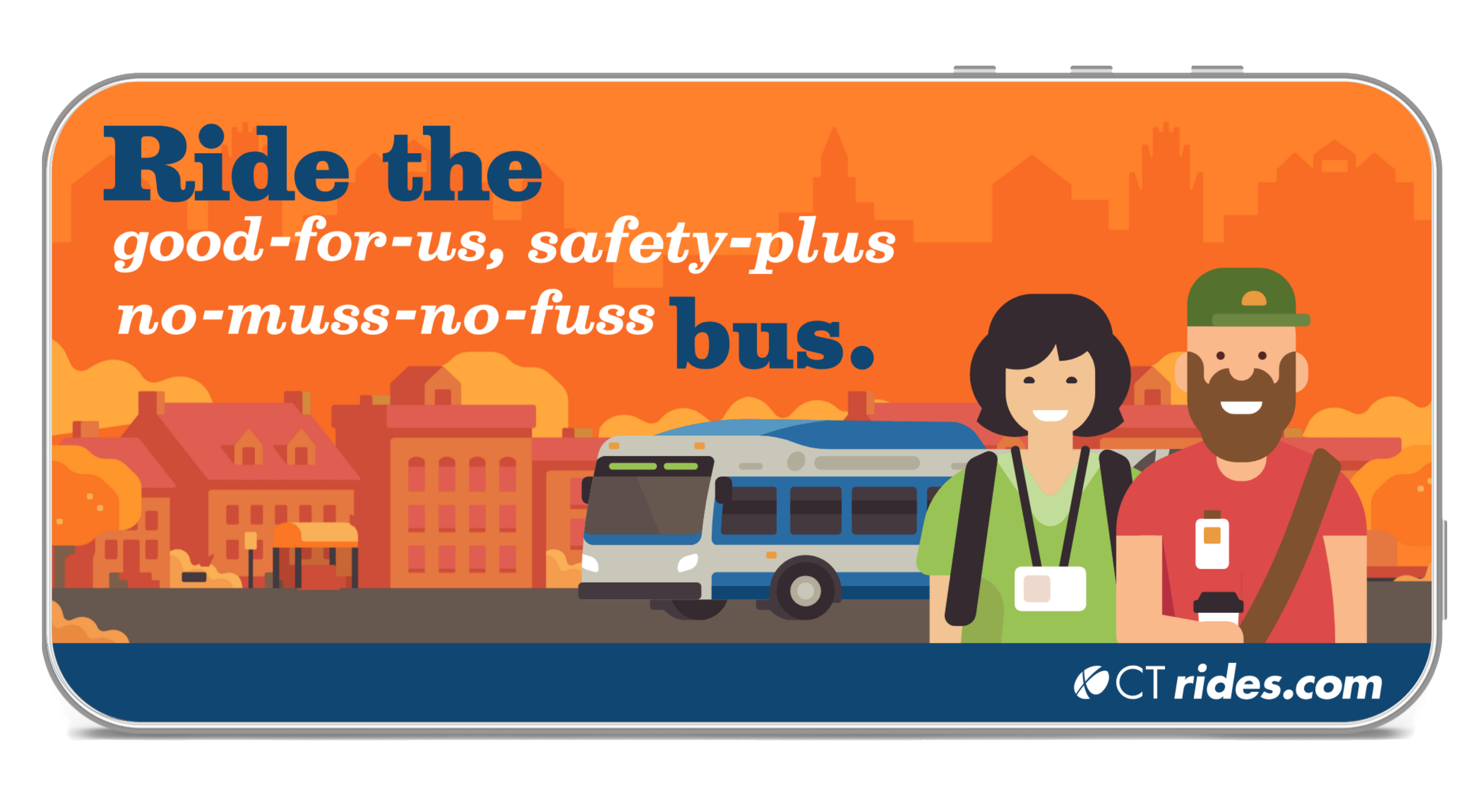
when the watsons were named agency of record, ctrides was already at the forefront of commuter management programs, but there was broad opportunity to develop a strong brand story and voice and encourage greater use of the resources they provide. from brand vision and proof points, to tone of voice, design and illustration style, we created an integrated campaign that included collateral, digital, out-of-home, website, radio, and more. to increase ctrides’ brand awareness, we created a tagline that also served as a higher-order descriptor: fewer cars. better air. healthier lives.
designs on a healthier connecticut.
our design needed to accomplish a number of goals. it had to be modern, appeal to a wide demographic, and convey an instant accessibility. functionally, it had to incorporate a diverse representation of people, connecticut-specific locations — and be equally effective promoting a variety of programs.
to accommodate these goals, the watsons decided early on to hire illustrators with experience in the transportation space to create a colorful, contemporary inventory of images that could provide all of the assets we needed—in a compelling way.
our color palette leveraged the brand’s existing logo colors—and incorporated new, modern colors that elevated the brand’s look.
next stop: help ct residents get back on track after the pandemic.
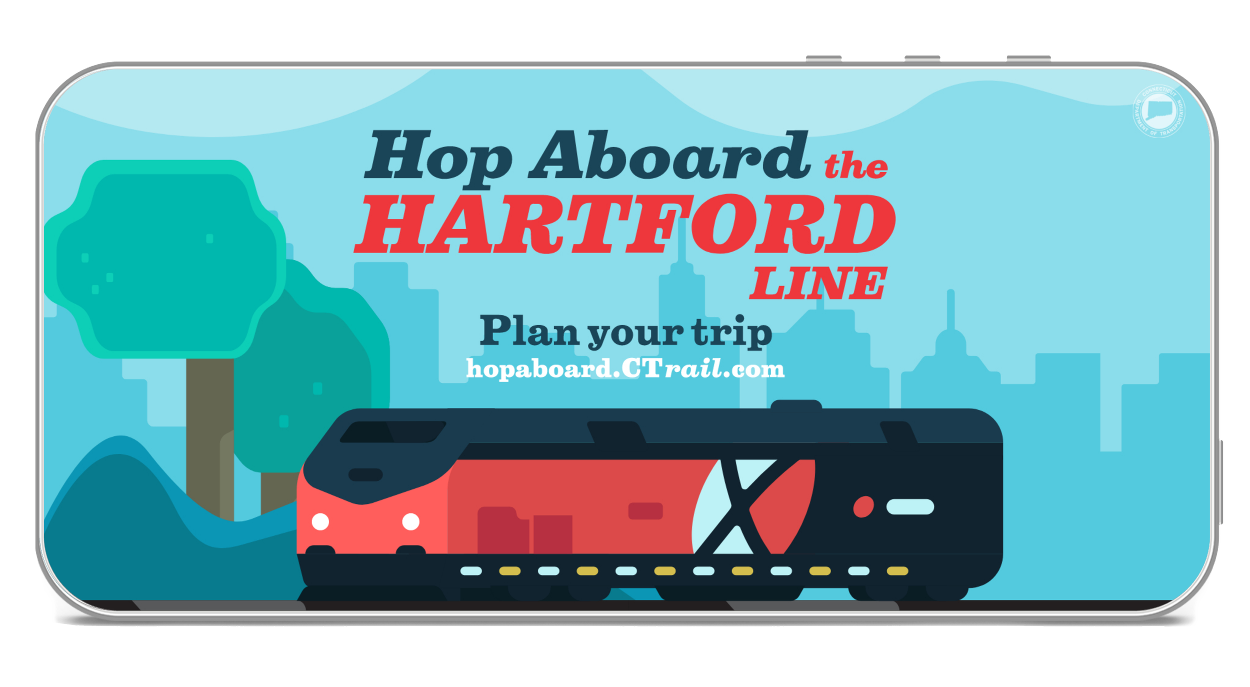
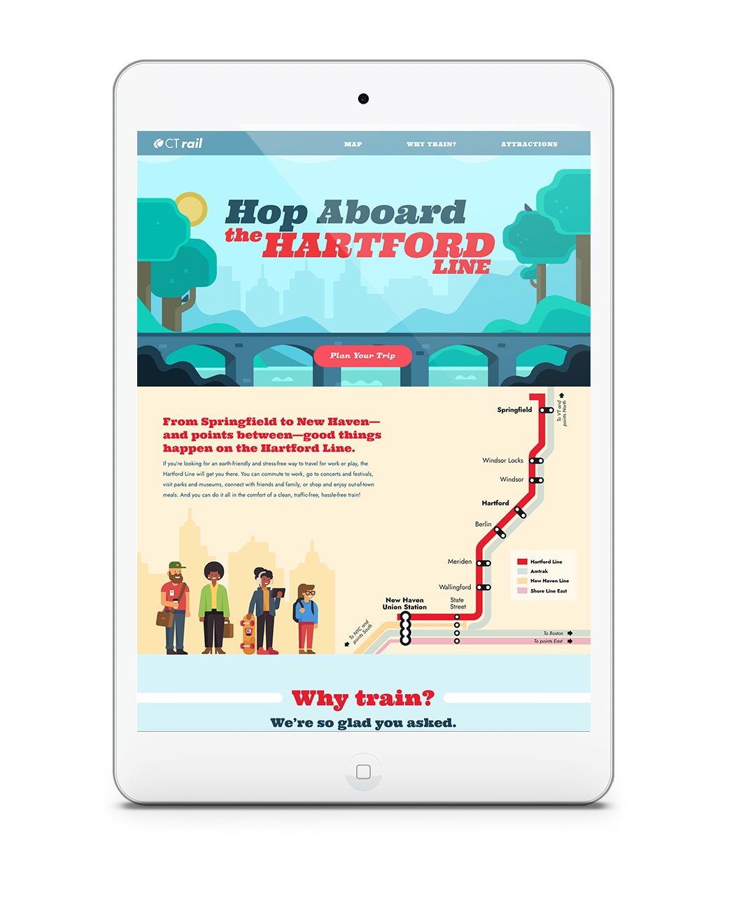
when ctrail, part of ctdot, set a date to restore their hartford line’s pre-pandemic schedule, we watsons created a campaign to get the word out. but our messaging had a bit of work work to do. not only did we need to raise awareness among ct residents, we had to overcome concerns about safety. looking to create a warm, welcoming, optimistic educational campaign,“hop aboard the hartford” was born.
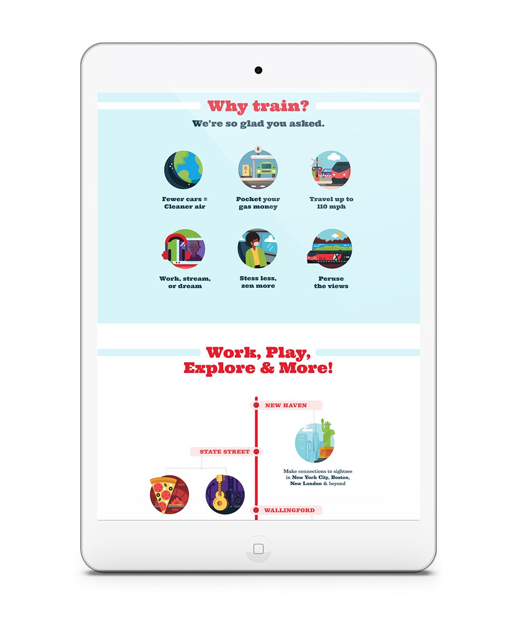
using pre-roll, social, a landing page, digital, and direct mail to reach residents at home, we brought a fresh illustration style to life with color, modernity, information, and animation, highlighting points of interest along the line. all aboard!


