view our featured work. or, view work by:
the watsons

we’re the watsons.
we specialize in advertising, advocating, anxiety-relieving, asking, branding, challenging, cost-saving, designing, digging, listening, pivoting, & supporting.
we’re fond of small type, big pours, and dogs of all sizes.

WATSNEW


filter: featured work.

the work.

johns hopkins medicine

johns hopkins medicine is a place in which extraordinary people do extraordinary things every day. we watsons are honored to have created a new employment branding campaign that brings that very notion to light – and at a time when finding talent takes new thinking.


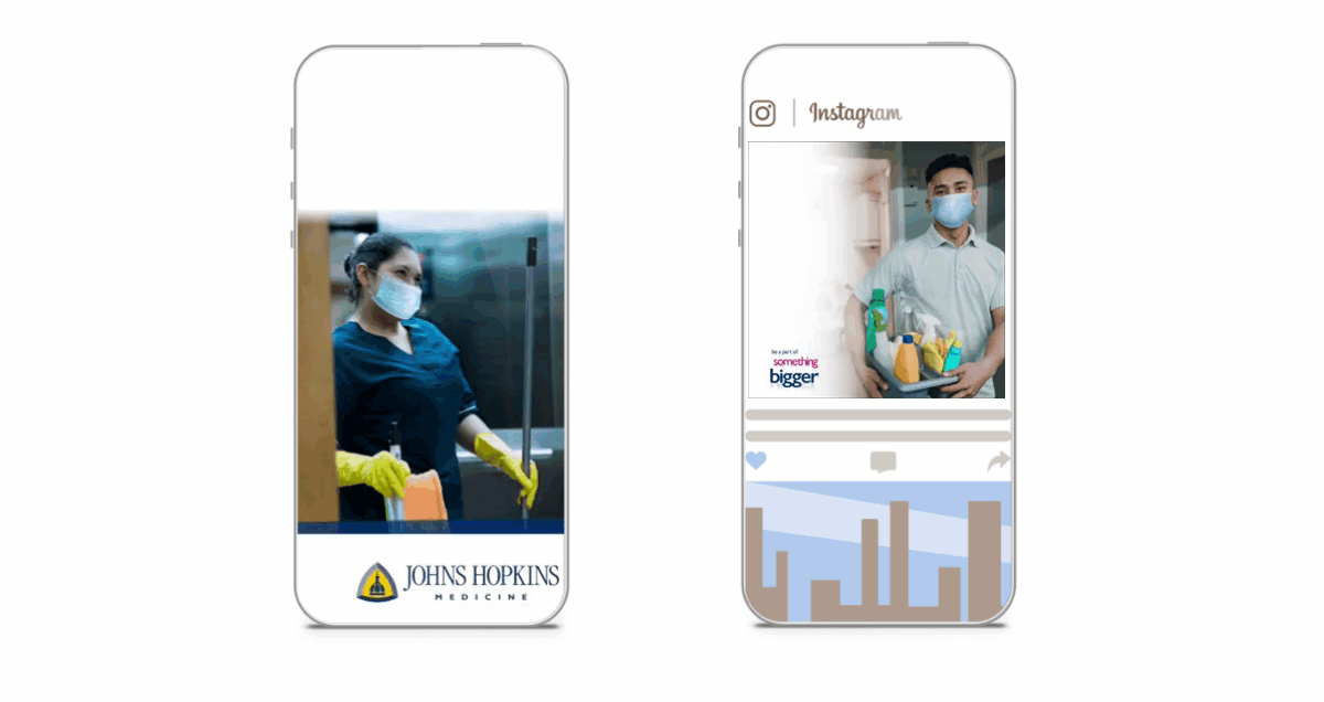
after onboarding eleven of johns hopkins’ entities, we developed branding campaigns for both nursing and key staff. in doing so, we created a resonant master brand flexible enough to allow for disparate selling points of each entity. 


creating a campaign starts with a tagline.

for positioning, we created a manifesto for both nursing and key staff, specifically transporting, linen services, environmental services, and food & nutrition. not only do the manifestos establish our positioning, they also convey key messaging and tone of voice – and culminates in a new theme line: be a part of something bigger.


the theme line enforces a higher order benefit that supports the familial culture, speaks to the size and structure of the organization leading to greater opportunity, and references working with purpose. this “caregivers one and all” approach for nurses and key staff became a multi-channel strategy that includes digital, social, linkedin, pandora, and a unified landing page.

virtua health system

when you’re a brand that exists to save lives and bring new ones into the world, you’re more brand virtue than brand benefit. how suitable then, to be asked to create a branding campaign for virtua health system’s breast cancer, obstetrics, and midwifery arms.


uncovering the virtues of virtua health system.

the watsons partnered with virtua health system in creating new, multi-channel ad campaigns to promote their exceptional offerings in breast cancer, obstetrics, and midwifery care. while they’re the largest health care provider in southern new jersey, the depth and scope of their expertise and program weren’t always top-of-mind.

treating the isolation in breast cancer.

to best convey virtua’s unique approach to treating patients with breast cancer, we pushed the level of individual support they provide to the forefront of our messaging. the fact is, every patient is provided their own nurse navigator who educates, supports, and advocates for them through every step of their journey. the messaging is less about touting virtual’s services than sharing their commitment to being there physically and emotionally for every patient.

two campaigns were developed, one with mantra-like messaging in type-only, and the other with evocative imagery—both shining a light on virtue’s unique commitment to helping people thrive—via personal, compassionate—and expert care.

something to love for every mom-to-be.

virtua was one of the first to recognize that the ways in which women wish to manage their pregnancies are as unique as the women themselves. as a result, they now provide the most comprehensive obstetrics and midwifery services in the region. pregnant women are encouraged to create their own maternity blueprints that perfectly their needs and wishes – and those of their families.

while laying out these services, the campaign also educates about the art and science of the lesser-known practice of midwifery. using aspirational, true-to-life imagery with resonant messaging, we showcased the spectrum of ways in which expecting women will receive more than they may have expected.

both campaigns used an integrated, targeted mix – digital, social, video, streaming radio, out of home, print, vehicle advertising, and more – all driving to a branded campaign landing page.

the organic project (top)

tampons. liners. and pads. oh my! and get this, they’re organic, biodegradable, and healthy for girls, their moms, and mother earth. our job? brand them and let the goodness flow!

branding a top notch mission-driven brand.

founded in 2018, the organic project (top) was created by two wily business exec-moms who came up empty-handed after searching for healthy, organic period products for their daughters. we watsons were asked to develop a shiny new rebrand that brings their story to light.

out of the gate, we developed brand vision and mission statements, laying the groundwork for messaging in both content and tone. rather than a standard positioning statement, we wrote a consumer-facing “womanifesto” that builds an evocative, humorous bridge between the brand and those it benefits. as we executed assets for each touchpoint — from packaging to point of sale, social to swag — our work culminated with a comprehensive brand guidelines book.

joy in a newly-designed box.

we then designed new packaging for all product SKUs, including tampons, pads, liners, sample packs, first period gift boxes, and new mom gift boxes. the updated brand aesthetic consists of soft, unexpected colors combined with a retro-mod, friendly serif that brings to mind women’s magazines of the 1970s.

a loud and proud digital campaign

using animated banners, short-form social animations, and sem, we put together a forward-thinking, insight-driven campaign that empowers girls through honest, often humorous messaging. we also built canva templates to give the client easy access to customizable, brand-compliant assets for social.

our design incorporates ultra-modern, 70s-inspired typography that brings bold confidence with a pinch of whimsy to every message. a clean palette of light blues with a textural background give a nod to the organic cotton and plant-based applicators that define the brand – and the messaging mirrors its environment with bold, playful, and unexpected brand promises.

physique 57

this is one time the watsons went to the barre and came out better for it. yes, it was a cool day at school when we were named agency of record for this amazing brand that celebrated bad-ass women — long before it was a thing.

branding_physique57_logo.jpg

when a luxury fitness brand needed a re-do, the watsons went to the barre.

the watsons were asked to rebrand physique 57, a boutique barre-based fitness company, with studios in new york city, the hamptons, beverly hills, bangkok, and dubai. their best-in-class instructors teach a unique blend of barre-based exercises with intervals of cardio, strength training, stretching, and recovery. while the service offering was being widely and enthusiastically embraced, the brand look and voice needed to better reflect its strengths.

we began with a full re-design, complete with a brand identity toolkit. for the logo, we updated the fonts and color palette to a more contemporary look. and while we maintained the blue logo font, we softened it to make it more upscale, changing the existing black to grey to meet the same objective.  to give the logo a more ‘of-the-moment’ editorial feel, we introduced a modern san serif front, sweet sans, and juxtaposed it with a serif called didot.

adv_physique57_TypeA_laptop_2500x1400.jpg

fitness meets fashion in a beautiful brand campaign.

the watsons then developed an integrated ad campaign that showcased the fierceness that embodied the instructors — and clients — of this unique urban brand.

partnering with photographer ty mecham, we shot portraits of physique 57’s long-term, passionate (a.k.a. ‘addicted’) clients, among them, fashion designer norma kamali. to show the full spectrum of the brand experience, we partnered with photographer leslie barbaro and shot classes in action. 

the new look was clean, elegant, and urban, reflecting the energy and attitude of the city itself. with a voice as empowering as the brand experience, we created an aspirational, representation of the powerful women at the helm — and heart — of physique 57. 

featured_physique57_kristina.jpg
adv_physique57_youphoria.jpg

upping the ante — downtown.

when the watsons were later asked to brand physique 57’s new studio in new york’s financial district (fidi), we took the opportunity to create a next-generation campaign refresh that put a spotlight on the brand’s greatest differentiator, its extraordinary instructors, while bringing physique 57’s mantra into the studio, on its walls, and on its merchandise.

we partnered with photographer, josé marquez, directing two shoots. the first, a highly-stylized, fashion-inspired approach, revealed how these women live the brand’s promise on every level. the second, which featured the instructors at work, was shot reportage style in the visually stunning baryshnikov arts center. the campaign consisted of print, out of home, digital, social, internal signage, and a new web site.

featured_physique57_FiDi.jpg
featured_physique57_selfie_mirror.jpg
boston children’s hospital

way back in 2006, we watsons were asked to create a nurse recruitment video for boston children’s hospital. one video turned into two. two, into a series. and a partnership was born. in 2014, we were named recruitment agency of record for this amazing place —and today, we’re blissfully still at it. kids and the people who make them well. how’s that for a client roster?

featured_bostonchidrenshospital_printad_1crop.jpg
featured_bostonchidrenshospital_printad_crop.jpg

a branding campaign for people with purpose.

even the world’s best brands have their challenges finding top talent. the key is tapping into those qualities that connect the brand with prospective employees in an emotionally-resonant way. for boston children’s recruitment branding and advertising, we took a detour from the “people at work” imagery ubiquitous to the category and put the focus on a shared purpose — kids. 

leveraging design elements of the consumer master brand, our campaign used evocative imagery of children in heartfelt moments. we created headlines that tap into the optimism of the brand, highlighting the many ways a career at boston children’s changes the lives of patients and staff alike. media assets included print, collateral, digital, and a brand new career site.

digital_bostonchildrenshospital_iphone_everyonegrowth-850.jpg
featured_bostonchildrenshospital_website.jpg

a very personal website — this one’s for the kids.

their abounding accolades aside, if you want to know how special boston children’s is, you only have to walk its hallways — because that’s where you’ll find their people. the question was, how do we show prospective employees the rarity of its culture? and the passion and diversity of its teams? 

the answer? a new careers site that lets boston children’s people do the talking. we interviewed and photographed employee ambassadors, asking them to post about their jobs across social media. in doing so, we gave job seekers the opportunity to follow actual employees and gain unprecedented access to their daily experiences. you’ll see them at work, get to know their colleagues, their passions, their inspirations, and who they are outside of the hospital. 

thanks to the contributions of some of their incredible talent, people were given a very real sense of boston children’s — from the comforts of their computers. a visit to the career site created an insight into the people, culture, and careers that make boston children’s the best of the best.

nurses, families and patients — brought to you by video.

as mentioned, our very first project for boston children’s was a nurse recruitment video that encapsulated the brand’s people, science, and unfettered caring. to come close to conveying the power of nurse-family-patient relationships, we interviewed all three (patient’s ages permitting), editing together their stories — from their unique points of view. the video was so successful, it was expanded into a series and used for multiple purposes beyond nurse recruiting. the videos also took the top prize at the telly awards.

columbia skincare

it’s not every day that you get to work with a company that’s been doing good things for over 147 years. so, we called ourselves lucky when columbia skincare asked us to brand their breakthrough topical probiotic cream.


featured_columbiaskincare_printad_web.jpg
featured_columbiaskincare_printad_2.jpg

branding a 147 year old start-up.

just a few years back, columbia skincare made a radical discovery: a chemical compound that works to enhance the body’s natural inclination to regenerate healthy skin cells. from that revelation, they created a first-of-its-kind topical probiotic that makes the skin renewal process more efficient—creating healthier, more beautiful skin. and it was our job to spread the word.

with a modern design and spirited messaging that called out the industry’s less-than-accurate anti-aging claims, our first step was to launch a 4-page insert in american spa magazine. the piece not only announced the product, it established the next generation of one of the most steadfast legacy brands in the country. 

on the heels of the insert, we further developed the new brand—launching a new digital ad campaign that drove customers to purchase online. we also developed comprehensive brand standards that guided us through the creation of social and influencer assets.

digital_columbiaskincare_iphone_850.jpg
featured_columbiaskincare_laptop_1.jpg
featured_columbiaskincare_laptop_2.jpg

a new home on the web.

the watsons designed columbia skincare’s first-ever direct to consumer e-commerce website. using parallax scrolling, the site is solely focused on the brand’s new product line, providing an in-depth overview of the science and outcomes that set them apart from the rest.

featured_columbiaskincare_tablet.jpg
new york city condom

in new york? need a free condom? we’ve got you covered with our condom finder app. created for the new york city department of health, access to condoms has proven highly effective in preventing the sexual transmission of HIV and other sexually transmitted infections (STIs). the app, a roadmap featuring 3500+ free condom locations throughout the five boroughs, is just what the doctor ordered.  

 
digital_newyorkcity_condom_app_1_850.jpg
digital_newyorkcity_condom_app_2_850.jpg