view our featured work. or, view work by:
the watsons

we’re the watsons.
we specialize in advertising, advocating, anxiety-relieving, asking, branding, challenging, cost-saving, designing, digging, listening, pivoting, & supporting.
we’re fond of small type, big pours, and dogs of all sizes.

WATSNEW


filter: featured work.

the work.

physique 57

this is one time the watsons went to the barre and came out better for it. yes, it was a cool day at school when we were named agency of record for this amazing brand that celebrated bad-ass women — long before it was a thing.

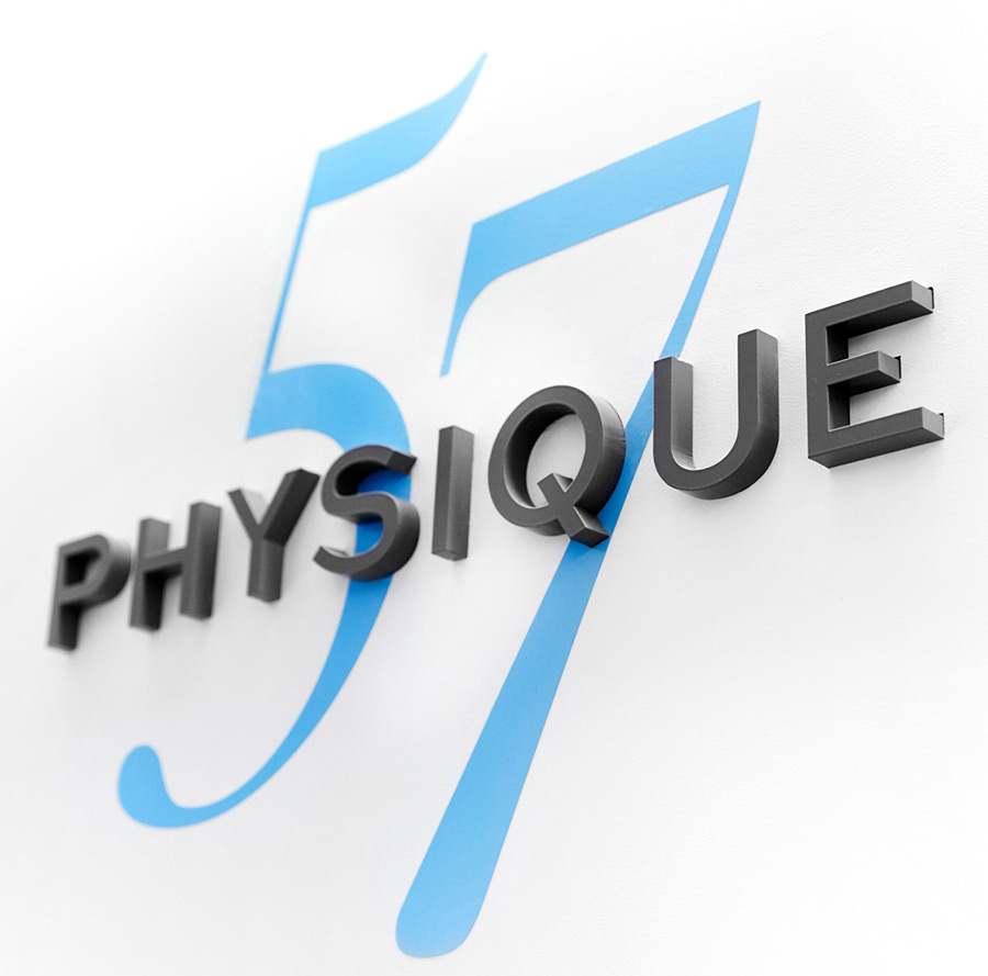
branding_physique57_logo.jpg

when a luxury fitness brand needed a re-do, the watsons went to the barre.

the watsons were asked to rebrand physique 57, a boutique barre-based fitness company, with studios in new york city, the hamptons, beverly hills, bangkok, and dubai. their best-in-class instructors teach a unique blend of barre-based exercises with intervals of cardio, strength training, stretching, and recovery. while the service offering was being widely and enthusiastically embraced, the brand look and voice needed to better reflect its strengths.

we began with a full re-design, complete with a brand identity toolkit. for the logo, we updated the fonts and color palette to a more contemporary look. and while we maintained the blue logo font, we softened it to make it more upscale, changing the existing black to grey to meet the same objective.  to give the logo a more ‘of-the-moment’ editorial feel, we introduced a modern san serif front, sweet sans, and juxtaposed it with a serif called didot.

adv_physique57_TypeA_laptop_2500x1400.jpg

fitness meets fashion in a beautiful brand campaign.

the watsons then developed an integrated ad campaign that showcased the fierceness that embodied the instructors — and clients — of this unique urban brand.

partnering with photographer ty mecham, we shot portraits of physique 57’s long-term, passionate (a.k.a. ‘addicted’) clients, among them, fashion designer norma kamali. to show the full spectrum of the brand experience, we partnered with photographer leslie barbaro and shot classes in action. 

the new look was clean, elegant, and urban, reflecting the energy and attitude of the city itself. with a voice as empowering as the brand experience, we created an aspirational, representation of the powerful women at the helm — and heart — of physique 57. 

featured_physique57_kristina.jpg
adv_physique57_youphoria.jpg

upping the ante — downtown.

when the watsons were later asked to brand physique 57’s new studio in new york’s financial district (fidi), we took the opportunity to create a next-generation campaign refresh that put a spotlight on the brand’s greatest differentiator, its extraordinary instructors, while bringing physique 57’s mantra into the studio, on its walls, and on its merchandise.

we partnered with photographer, josé marquez, directing two shoots. the first, a highly-stylized, fashion-inspired approach, revealed how these women live the brand’s promise on every level. the second, which featured the instructors at work, was shot reportage style in the visually stunning baryshnikov arts center. the campaign consisted of print, out of home, digital, social, internal signage, and a new web site.
featured_physique57_FiDi.jpg
featured_physique57_selfie_mirror.jpg
boston children’s hospital

way back in 2006, we watsons were asked to create a nurse recruitment video for boston children’s hospital. one video turned into two. two, into a series. and a partnership was born. in 2014, we were named recruitment agency of record for this amazing place —and today, we’re blissfully still at it. kids and the people who make them well. how’s that for a client roster?

featured_bostonchidrenshospital_printad_1crop.jpg
featured_bostonchidrenshospital_printad_crop.jpg

a branding campaign for people with purpose.

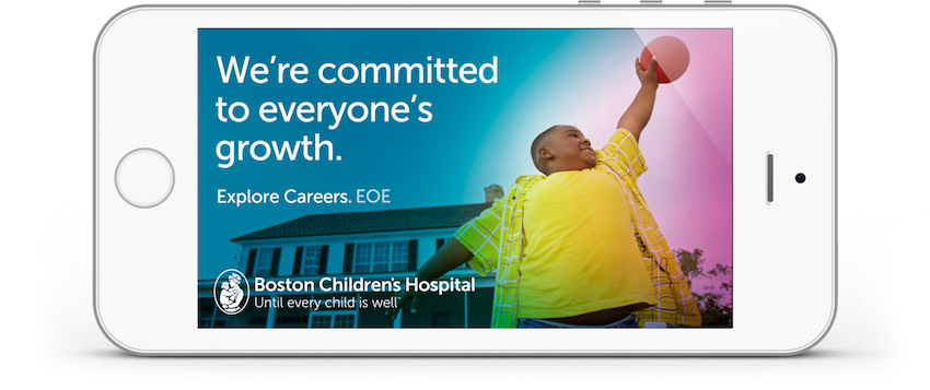
even the world’s best brands have their challenges finding top talent. the key is tapping into those qualities that connect the brand with prospective employees in an emotionally-resonant way. for boston children’s recruitment branding and advertising, we took a detour from the “people at work” imagery ubiquitous to the category and put the focus on a shared purpose — kids. 

leveraging design elements of the consumer master brand, our campaign used evocative imagery of children in heartfelt moments. we created headlines that tap into the optimism of the brand, highlighting the many ways a career at boston children’s changes the lives of patients and staff alike. media assets included print, collateral, digital, and a brand new career site.

digital_bostonchildrenshospital_iphone_everyonegrowth-850.jpg
featured_bostonchildrenshospital_website.jpg

a very personal website — this one’s for the kids.

their abounding accolades aside, if you want to know how special boston children’s is, you only have to walk its hallways — because that’s where you’ll find their people. the question was, how do we show prospective employees the rarity of its culture? and the passion and diversity of its teams? 

the answer? a new careers site that lets boston children’s people do the talking. we interviewed and photographed employee ambassadors, asking them to post about their jobs across social media. in doing so, we gave job seekers the opportunity to follow actual employees and gain unprecedented access to their daily experiences. you’ll see them at work, get to know their colleagues, their passions, their inspirations, and who they are outside of the hospital. 

thanks to the contributions of some of their incredible talent, people were given a very real sense of boston children’s — from the comforts of their computers. a visit to the career site created an insight into the people, culture, and careers that make boston children’s the best of the best.

nurses, families and patients — brought to you by video.

as mentioned, our very first project for boston children’s was a nurse recruitment video that encapsulated the brand’s people, science, and unfettered caring. to come close to conveying the power of nurse-family-patient relationships, we interviewed all three (patient’s ages permitting), editing together their stories — from their unique points of view. the video was so successful, it was expanded into a series and used for multiple purposes beyond nurse recruiting. the videos also took the top prize at the telly awards.

bartlett tree experts

we’re going to go out on a limb here and say that our love for bartlett tree experts can’t be shaken. nor can our use of tree puns. as agency of record for this century-old, family-owned company, we’re so proud to shine some sunlight on all they do. good for our trees, good for our environment, where bartlett grows, so grow we. guess we barked up the right tree. sorry.

featured_bartlett_printad_2.jpg
featured_bartlett_printad_1.jpg
adv_Bartlett_mobile3_850.jpg

they are the champions, my friend.

bartlett tree experts is the largest residential tree care company in the world. and with the most extensive r&d lab in the country, every bit of their work is grounded in science.

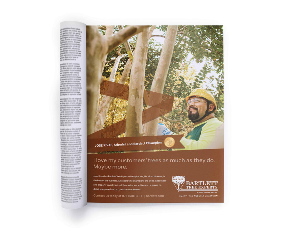
as a company—and a brand—bartlett understands that its greatest asset is its people. so when they wanted to make their successful employee recognition program, ‘bartlett champions’, a consumer-facing campaign, we were on it. all we had to do was to find a way to make an internal program work in the outside world.

to do so, we featured each champion with headlines showcasing just how passionate, slightly-obsessive, encyclopedic, tree-geeky, happy, and amazingly likable they are. in other words, we showcased real people who are exceptional at what they do — in a way that was authentic to each of them.

the design used hero imagery of champions outside, among the trees, where they love to be — with a ribbon graphic representing their place of honor in the company. in the end, the people who make bartlett the best in the world, became living proof of every brand promise.

featured_bartlett_tabletlookbook.jpg

a look book paints a thousand words.

to showcase the beautiful and prodigious body of work in a manner that can be easily accessed by their arborists to support sales and service efforts, we created an immersive website with a swipe-able parallax portfolio of stunning wall-to-wall images. the photography flows beautifully from one case study to the next, and provides the mobility to do so via tablet — at a conference or on a sales call. and moving their materials from collateral to web allowed us to create a solution that’s environmentally in line with the company’s mission.

with a commercial client list that includes iconic settings like the 911 memorial & museum, san francisco botanical gardens, johnson & johnson headquarters, and the university of chicago, the imagery alone spoke volumes.

featured_bartlett_autumn_trees.jpg
featured_bartlett_winter.jpg

social media takes root.

since education is inspiration, the watsons also developed a suite of social tools that included shareables, cover messages, and twitter headers. content-wise, we talked seasonal tips, preventative checklists and created infographics to help people manage tick populations and learn about organic pest control. and, because to know bartlett is to like them, the response has been profoundly thumbs-up.

featured_bartlett_brochures_fan.jpg

collateral. by design.

with a broad spectrum of services, and sales, and service teams from coast to coast, we needed to create a suite of collateral that looked as progressive as the science at their center. a consistent corporate-meets-modern design was created that introduced new fonts, a refreshed color palette and photo style — and an icon system representing each service.

rick’s picks

in the summer of 2010, the watsons were named agency of record for the artisanal pickling brand, rick’s picks. we first got to know the brand as customers, having discovered them on the shelves of another client, whole foods market. let’s just say, it was love at first bite (had to). but things got really interesting when we met the slightly-idiosyncratic, ever-charming founder of the brand, rick field. a man with a vision who needed an agency with a plan.

featured_rickspicks_jars.jpg

a new label design for the brine.

when rick and co. asked us to refresh the brand under one well-designed roof, that’s exactly what we did. with a new label design that brought to market a restrained, retro-modern take that showcased the vibrant authenticity of the brand. by highlighting their beloved icons alongside their health benefits, we were able to give a vibrantly refreshed look to each and every pickled delight. 

each label reflects the unique personality and flavor profile of of its pickled product. we also added fun factoids to the ingredients, like pairing phat beets with goat cheese and crackers, brining your brisket with smokra, or, a favorite, using the hotties brine to make one bloody good bloody mary. customers now know that what’s inside a rick’s picks jar is good to the last drop.

featured_rickspicks_jars_2.jpg

dressing the pickles for mass market.

rick created a brand new line of pickles for mass market distribution — and we dressed them up with a new design. the line, called the pickle essentials, is a trio of rick’s most popular cucumber pickle chips (garlic dill, sweet, and spicy). as always, we wanted these new labels to remain uniquely rick, while holding their ground against pickle heavy weights like vlasic, claussin, and mt. olive.

inverting the white-to-color ratio was the departure point. from there, the design established rick as king among pickle makers via ribbon and banner-style iconography and graphics, alongside the clean and classic typography that his brand was already known for. long live the pickler.

featured_rickspicks_website.jpg

a refreshing website refresh.

we watsons also had the opportunity to give rick’s website a face (and voice) lift. using the same suite of iconography that we created for the labels, we designed a simple, user-lovable site that makes it easy — and fun — to purchase piquant pickles with prodigious pucker power.

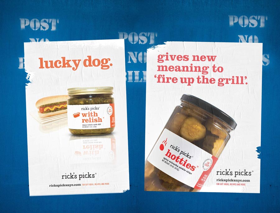
featured_rickspicks_wildposting_horiz.jpg
adve_rickspicks_iphone_hotties-copy.jpg

an ad campaign that puts brine on the brain.

we established a brand voice as playful as the products—and the founder himself. and we developed a suite of collateral, print, and digital advertising that reminded audiences of the simple pleasures that come from fresh ingredients transformed into something unforgettable.

we also took over the brand’s social extensions, building affinities through shareable art, recipes, fun facts, and tips. we re-designed the brand’s booth for the fancy food show (among others), designed a branded skin for their delivery vehicle, helped make rick’s merch even more purchase-worthy, and designed reusable bags that served as an homage to local produce and the fine state of new york.

ricks_picks_snacking_pickles_package_design1.jpg

a cravey new snacking pickles brand.

people love pickles. people love healthy snacks. and people are positively passionate about rick’s picks snacking pickles, for which we developed the package design—and all of the ensuing branding. at the heart of it all is a happy little pickle-snacker named, kirby. illustrated in-house, kirby is a fun, mod ‘brined’ ambassador who’s loved by demos boomer to z. and kirby looks swell on swag, like t-shirts, stickers, beer koozies, and baseball hats. our branding work also included the tagline—‘crispy. savory. cravey.’—as well as collateral, a landing page, and social assets.

msg entertainment

ads will be made. logos will be designed. names will be dropped. fun will be had. that’s what it is to partner with madison square garden entertainment (msge), the people who own the city’s coolest stages — where everyone goes to see the city’s hottest shows. 

branding_MSGE_RadioCityChristamsSpectacular_logo.jpg

logos a go go.

to celebrate the 75th anniversary of the legendary radio city christmas spectacular, we created a new logo design and accompanying collateral. the following year, we were faced with a christmas conundrum. how do we leverage the enormous success of last season’s 75th logo while setting the tone for the next 75 years? the answer: showcase the best of both. by drawing from the iconic elements of the venue; the towering vertical marquees, the glowing neon, the soaring wooden soldier, and the proscenium that frames the great stage, we infused the magical feeling of a child’s first visit, while retaining the perspective of the 75th celebration. it’s a logo befitting the most spectacular holiday brand of them all.

the watsons were also honored to design venue logos and create brand standards for chicago theatre, beacon theatre, wamu theater, wang theatre, westminster dog show, and their charitable foundation, garden of dreams.

featured_MSGE_logos_3_up.jpg
featured_MSGE_radiocity_75_christmasspectacular_tablet.jpg
featured_radio_city_brochure.gif

every show’s an event.

we’ve created advertising for concerts, television specials, theatrical shows, and speakers, including, but not limited to the tony awards at radio city music hall, elton john’s 60th birthday concert at madison square garden, and the concert featuring paul simon with surprise guest, art garfunkel, at the newly restored beacon theatre. concerts for madonna, u2, and p!nk. shows like the wizard of oz and cirque de soleil. and speakers like bill maher vs. ann coulter — and president barack obama (we miss you...) to name a very few.

all the while, the watsons developed image advertising and holiday cards for the venues; and building and backstage tour collateral. and when billboard magazine named madison square garden and radio city music hall the #1 venue of the decade (in their respective size categories), we made sure it was known — and celebrated — the world over.

featured_MSGE_radiocity_tonyawards_ad_playbill-copy.jpg
featured_MSGE_speakers_wildposting.jpg
montclair state university

one of the happiest highlights of our 15 years of watsondom was being named agency of record for montclair state university. if we had a nickel for every time we left the campus saying, ‘i wish i could go here’ we’d need to ask a math major to help us calculate our wealth. this potently productive partnership makes us proud to be red hawks — even if it is in spirit only.

featured_montclairstateuniversity_brochurecover.jpg

montclair state’s new campaign is very much ready.

what began as a normal school in 1908, preparing a handful of students to become teachers, is today a nationally-ranked, research doctoral institution — with more than 21,000 diverse students and over 300 majors, minors, concentrations, and certificate programs. 

as a university experiencing unprecedented growth and recognition, it was time to illuminate their place of leadership in the enrollment marketplace. 

our goal was to develop an anthemic brand concept with the flexibility to speak both universally and specifically to a spectrum of benefits. we also aimed to create a campaign that broke from the category’s clutter of sameness. 

the result is a campaign we call ‘red hawk ready’, which speaks to the many ways in which montclair state readies its students for lifetimes of success. 

the messaging leverages the university’s momentum in a way that’s distinctively montclair state: no other brand can say this or look like this. we also created a next-generation design that centers on a modern and sophisticated use of msu’s core red color — with typography that reflects the dynamic and progressive nature of the school itself. and while there are other schools in the region whose colors include red, we made sure montclair state was the only school to own it.

featured_montclairstateuniversity_brochurespread.jpg

a spot-on approach for generation z.

at its core, the red hawk ready concept is about moments, big and small, that prepare students reach their goals in education — and in life. the ready video spots serve to bring that thinking to life by way of a spectrum of moments that show people in the process of readying themselves in ways as simple as walking to class, opening a book, or starting the day with a run — and as transformative as taking the stage to give a speech and entering an elevator to begin a first internship. each spot creates an anthemic, evocative story that says, at montclair state, getting ready for the new world is a powerful, positive experience — in and of itself. spots were created for undergrad, grad, and csam, the innovative school of communications and media.

adv_montclairstateuniversity_outdoor_br.jpg
featured_montclairstateuniversity_social_advertising_facebook_instagram-850.gif

taking the campaign to integration nation.

using media that ranges from snap ads and ooh to digital and collateral, this campaign uses a multitude of media to showcase a multitude of offerings. the integrated campaign is running on facebook, instagram, and youtube pre-roll — and in the form of digital display, collateral, and infographics. we also created interactive posters for the admissions office, inciting prospective students to take and post selfies with them.

cabot creamery

cabot creamery makes premium-quality, locally produced, incredibly delicious cheese. amen. when cabot asked us to raise their profile in the new york market, we cried a little (happy tears) then dug into the challenge. 

featured_cabot_wild_posting.jpg

smile and say, cabot.

while the cabot brand is well known in new england, where they have a number of family farms, awareness is not as high in new york state, despite their having farms there too. our job? a higher profile for greater new york marketshare.

kicking things off with research, we discovered that while most people buy one cheese for cooking, another for snacking, and yet a third for entertaining, cabot showed the greatest versatility, coming out on top in all three categories. in our minds, that made them, “the best cheese on the block”.

featured_cabot_displaybanner_inmedia_laptop.jpg
featured_cabot_web_display_banners.jpg

a thanksgiving do-over.

with thanksgiving just around the bend, we created an event sponsored by cabot that gave new yorkers the opportunity to win their version of the perfect holiday celebration. named “friendsgiving”, the winner could celebrate with ten people of their choosing — after the obligatory family gathering was over.

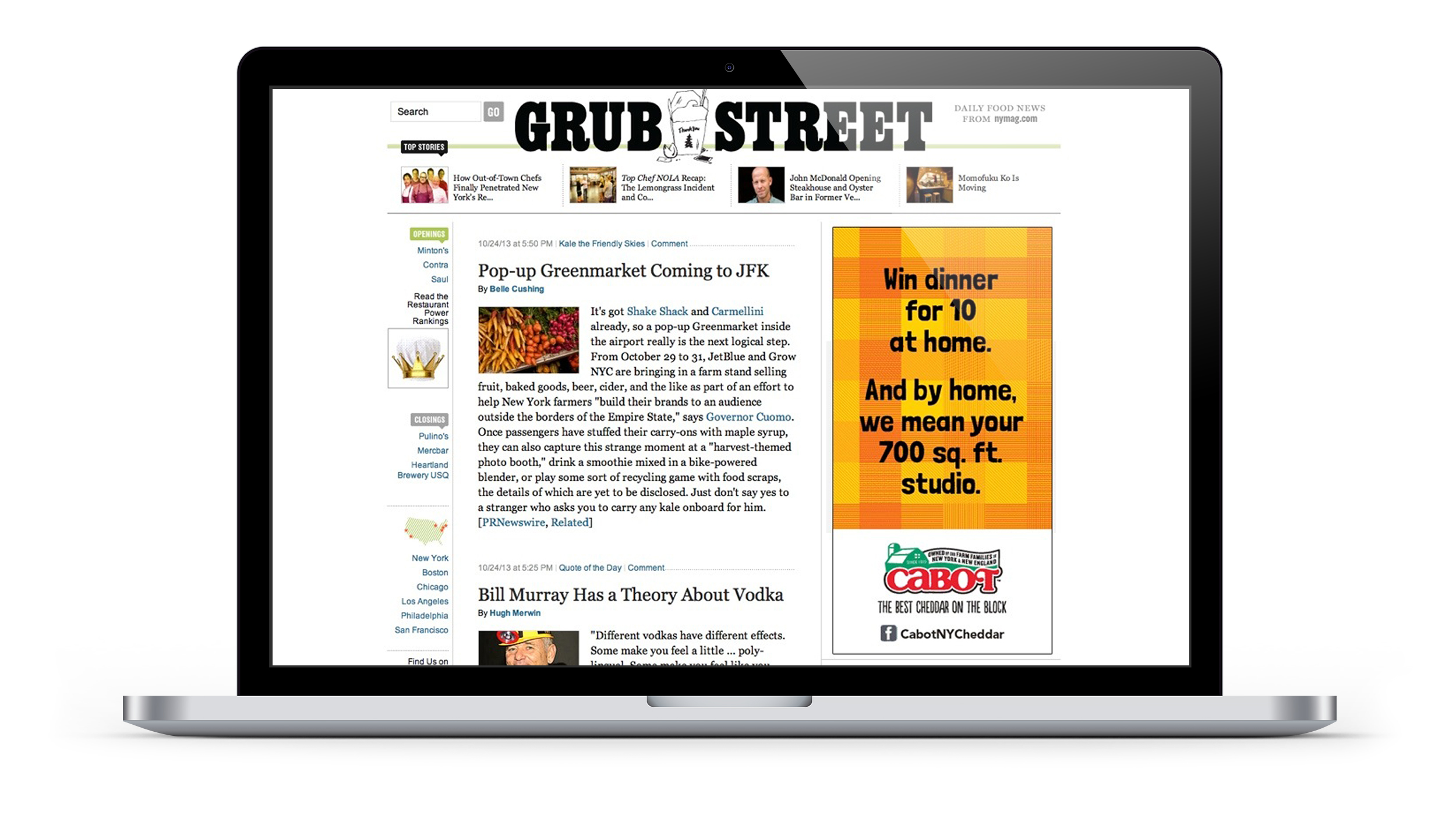
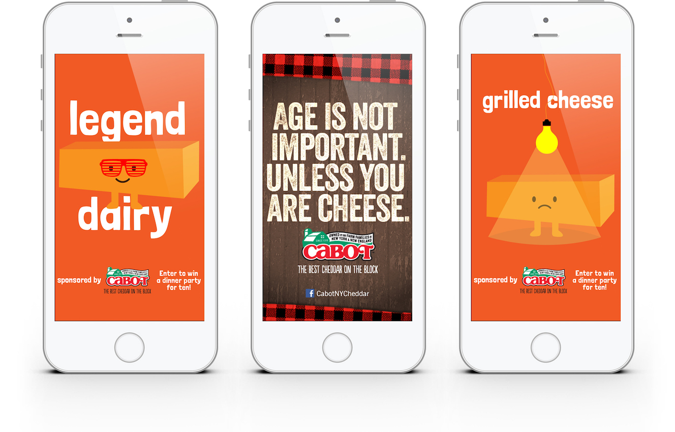
we drove new yorkers to cabot‘s new york facebook page, where they could enter to win a fully catered dinner for ten in their homes. with an online media campaign running across nymag.com, grubstreet.com, chowhound.com, time out new york, new york magazine, and more, full-page takeovers in time out new york and grub street highlighted both the contest and the brand’s local farms. the campaign also included wild posterings, shareable art, and facebook ads.

in just ten weeks, we added nearly 4,500 nyc/tri-state area fans to cabot creamery’s nyc facebook page. 

featured_cabot_social_mobile copy.jpg
featured_cabot_tastingevent.jpg

a taste of success at hearst publishing

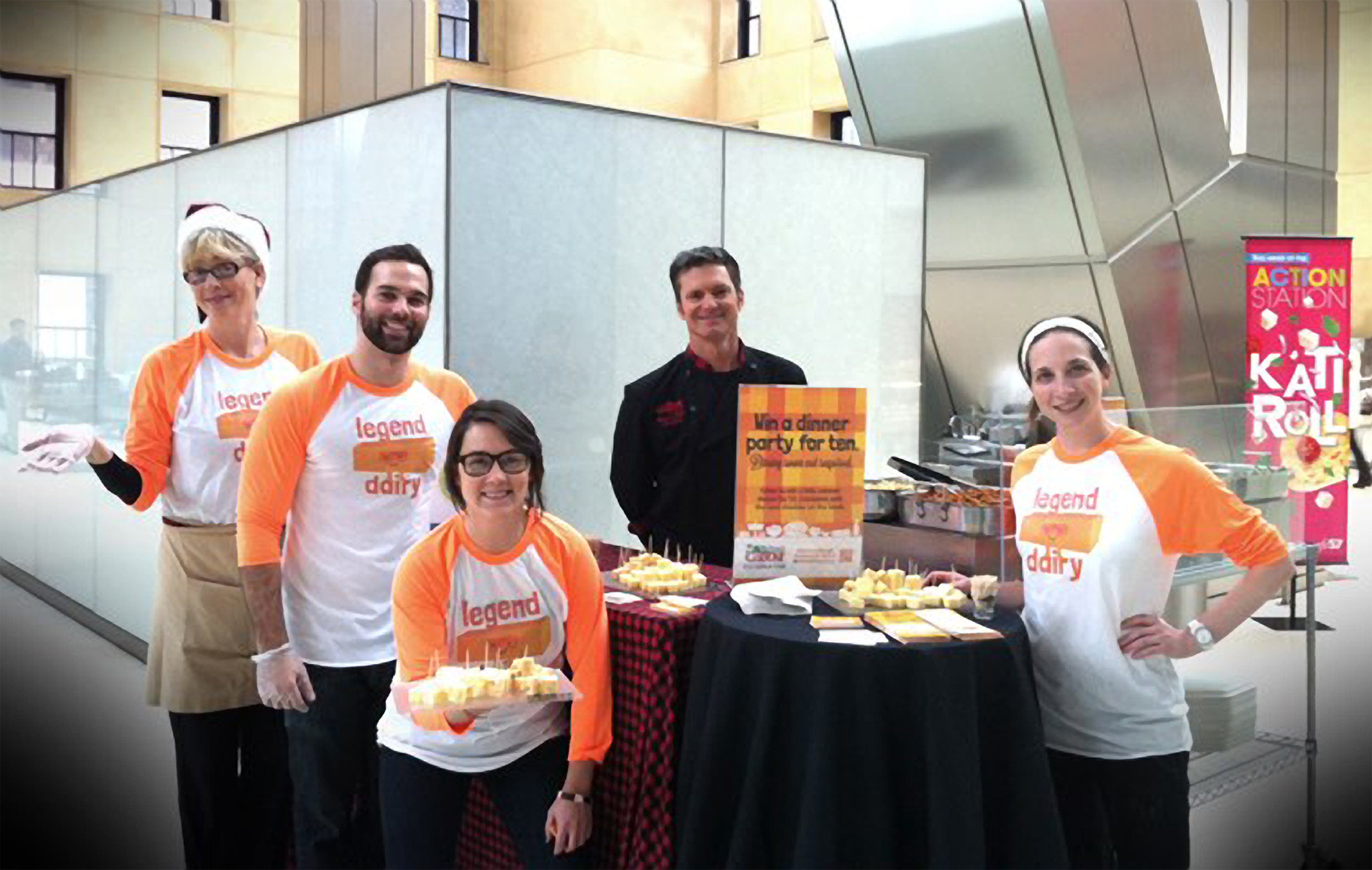
we also promoted the holiday event to hundreds of hearst corporation employees — in the comfort of their own cafeteria. cabot chef jimmy kennedy came down and cooked up some amazing cheese dishes, with free cheese samples to boot. cabot was a hit and all who attended, including o magazine’s gayle king, went back to work feeling like a big cheese.

hint

hint water approached us about developing a campaign for their naturally flavored waters and new product, hint fizz. always thirsty for a challenge, we created a national digital, social, and point of purchase campaign. and let’s just say, it was a pleasure helping them blow the other drinks out of the fizzy, tasty water. 

featured_hint_bodega_door_poster.jpg
featured_hint_print_advertising_2up.jpg

pop goes the water.

after working with hint water to help promote a healthy alternative to calorically laden sodas and juices, the watsons designed display cases for stores across the country. what followed was an in-your-face point of purchase campaign that was hung on bodega doors around the city.

the brand voice was bold and youthful, having fun with some favorite colloquialisms of the day. visually, the bottle was the hero, popped in a field of bright colors and adorned with a halo effect.  the look was poppy, youthful, and bold with colors that reflected the natural fruits inside them.

featured_hint_print_advertising_mag.jpg
featured_hint_mobile_advertising-850.jpg
featured_hint_endcap_2.jpg
new york liberty

some dream clients come your way magically. like when one of our founding partners wrote a love letter to her favorite sports team — adding a few thoughts about their recruiting and marketing. days later, we were invited to present against a field of sports marketing firms. and just like that, the watsons were agency of record for the wnba’s new york liberty.

advertising_newyorkliberty_outdoor_msg.jpg

give us liberty.

out of the gate, we created a campaign that reflected not just the liberty team, but the experience. yes, fundamentally, they’re about hoops. but they’re also a high-energy entertainment experience — wrapped in music, dancing, community — and some very special world-class athletes who play, not for the paycheck, but for the love of the game. that’s what we call, raising the game.

from tickets to transit to tv — and lots of digital in between — our branding spoke to the overall kickass-ness of the women who put the liberty — and the wnba — on the map. we also celebrated the amazingly diverse fans who unfailingly come to see them. unrivaled nyc entertainment, a sense of belonging, basketball in its purest form – all at the greatest sports arena in the world. yep, that’s liberty for all.

featured_newyorkliberty_digital.png
advertising_newyorkliberty_postcard.jpg
advertising_newyorkliberty_bus_side.jpg

ten years old and growing like a weed.

when the wnba and liberty launched in 1997, a lot of people said they wouldn’t last. so when they reached their tenth anniversary, we decided to remind those people just how wrong they were. using subway car posters and billboards, we took to the streets and tunnels of new york to celebrate this happy milestone.

advertising_newyorkliberty_subway_ad_2.jpg
advertising_newyorkliberty_tony_printad.jpg

basketball shorts.

if you’ve been to new york, you know that hailing a cab can be a frustrating, and often times cutthroat, experience. luckily, we had a good samaritan like the new york liberty’s kia vaughn on our side. this and other mini videos were all part of our social media series: bball shorts. 

featured_newyorkliberty_swag_images.jpg

sass, swag, and signage.

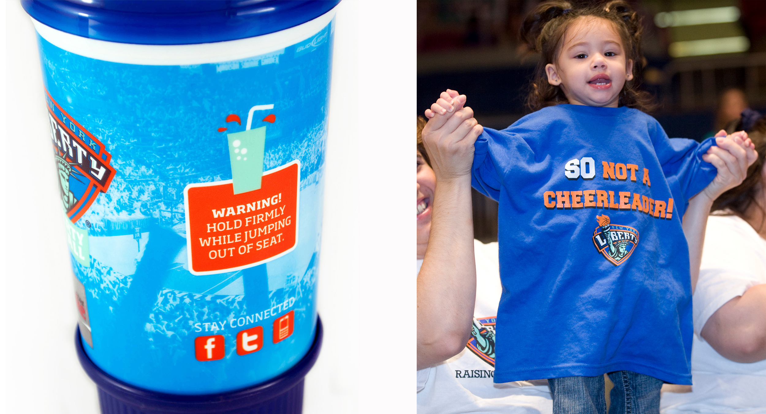
we went wall-to-wall with a wild postering campaign that appeared all over the city. and, to celebrate the liberty’s much beloved fans, we harnessed the power of facebook and twitter for favorite pics, which we used in a mural inside madison square garden’s mall. we also designed t-shirts, including one that declared, “so not a cheerleader”. how well did it resonate with fans? let‘s just say, they‘re all sold out. 

bringchange2mind

stop us if you’ve heard this one. glenn close, ron howard, and the watsons walk into grand central terminal and film an historic psa that actually does end up changing lives. that’s what happened when we were asked to create a brand — and psa — to help glenn and her family fight the stigma of mental illness. yep, we pinched ourselves.

a brand for change is born.

the bringchange2mind brand and campaign were created from the ground up. beginning with the name, identity, and marketing strategy, it would evolve into the first national advertising effort in history designed to combat the stigma associated with mental illness. with 1 in 6 adults suffering from mental illness, we only wished we could have done it sooner.

how do we take an unpopular topic and make it resonate with prospective funders, those who perpetuate stigma and those who have been directly touched by mental illness? begin with an identity that looks as optimistic as it sounds. in its simplest form, the tagline is the brand’s mission: change a mind and you can change a life.

and because the website was to be a place where people could get the help and community they need, we made the logo the brand’s url. 

featured_bringchange2mind_behindthescenes_4up.jpg

the psa that brought it.

the bringchange2mind campaign kicked off with a national psa that was shot in the iconic grand central terminal (also a watsons client). directed pro bono by ron howard with music donated by john mayer, the spot featured 80 volunteers, many of whom are living with mental illness, and five people who outed themselves by wearing their illness on their t-shirts.

walking side-by-side with a loved one, the concept was designed to visually illustrate what one in six people looks like. to break down stigma by showing how common mental illness is. how we’re all touched by it in one way or another.

the spot was picked up by time warner cable, comcast cable, charter cable, lifetime network and fox networks. additionally, screen vision showed the PSA on 260 movie screens, and ncm (national cinamedia) with in-lobby plasma screens in 950 of their cineplexes. Hulu.com featured both the psa and the “making of’ video. 


the initial promotional effort included appearances on good morning america, the view, dr. nancy snyderman and nbc nightly news. glenn was also featured in o (the oprah magazine), reuters, and huffpo, for which she wrote an article about her family‘s journey.

adv_bringchange2mind_taxi.jpg
featured_bringchange2mind_billboard.jpg

local ad campaign does good.

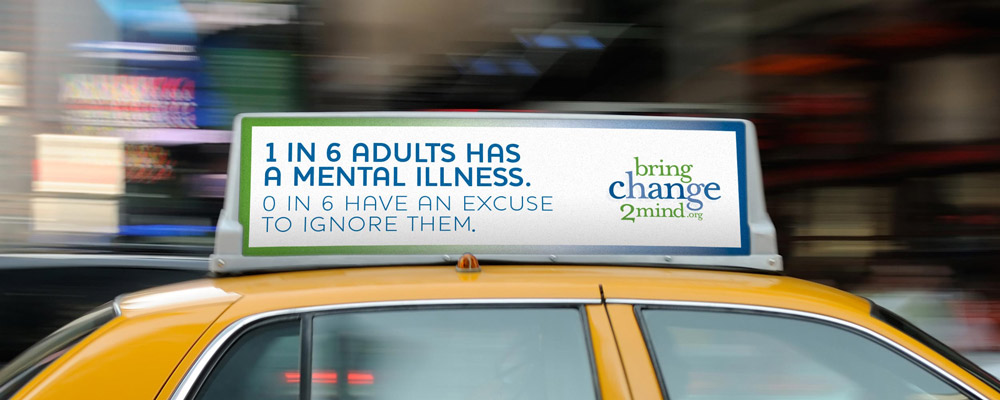
do you know that a mental illness is a disease, not unlike diabetes, or cancer? and did you know that the one in six americans who have a mental illness can suffer as much from the stigma and discrimination they face as they do their disease? that’s the thinking behind the out of home, digital, email, and print campaign that spread its message in local markets from new york to l.a.

we launched a robust, branded website that contains behind-the-scenes interviews with people featured in the psa, and education-rich content, including contact numbers for people who want more information and/or need help. we also created a branded community on facebook. 

adv_bringchange2mind_printADmag.jpg
adv_bringchange2mindmobile_850.jpg

the results were in.

in its first months, bringchange2mind.org had 3 million+ hits, more than 285,000 visits and 700,000+ page views from more than 150 countries. there were over one thousand emails for non-emergency assistance — all of which were answered within 48 hours. 

the brand’s facebook presence was brimming with 40,000+ active fans who have contributed thousands of posts. the psa itself has received 238,000 views on youtube.

demand for shirts worn in the psa resulted in the creation of an e-commerce section of the site, which aids in funding the effort moving forward. 

columbia skincare

it’s not every day that you get to work with a company that’s been doing good things for over 147 years. so, we called ourselves lucky when columbia skincare asked us to brand their breakthrough topical probiotic cream.


featured_columbiaskincare_printad_web.jpg
featured_columbiaskincare_printad_2.jpg

branding a 147 year old start-up.

just a few years back, columbia skincare made a radical discovery: a chemical compound that works to enhance the body’s natural inclination to regenerate healthy skin cells. from that revelation, they created a first-of-its-kind topical probiotic that makes the skin renewal process more efficient—creating healthier, more beautiful skin. and it was our job to spread the word.

with a modern design and spirited messaging that called out the industry’s less-than-accurate anti-aging claims, our first step was to launch a 4-page insert in american spa magazine. the piece not only announced the product, it established the next generation of one of the most steadfast legacy brands in the country. 

on the heels of the insert, we further developed the new brand—launching a new digital ad campaign that drove customers to purchase online. we also developed comprehensive brand standards that guided us through the creation of social and influencer assets.

digital_columbiaskincare_iphone_850.jpg
featured_columbiaskincare_laptop_1.jpg
featured_columbiaskincare_laptop_2.jpg

a new home on the web.

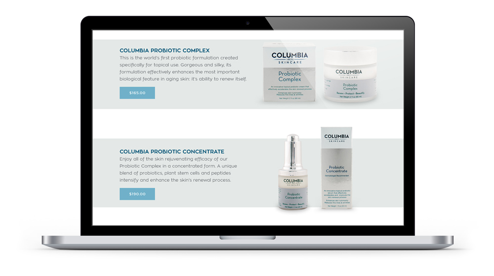
the watsons designed columbia skincare’s first-ever direct to consumer e-commerce website. using parallax scrolling, the site is solely focused on the brand’s new product line, providing an in-depth overview of the science and outcomes that set them apart from the rest.

featured_columbiaskincare_tablet.jpg